version control for prompts. the thing every AI team needed but no one had built.
FutureAGI Workbench is the structured environment where AI engineers and prompt engineers write, iterate, test, and evaluate their prompts before those prompts reach production. It treats the prompt the way software teams treat code: as something with structure, versions, intent, and a standard for what "good" means.
Before Workbench, every AI team had some version of the same informal system: prompts in a shared Google Doc, a Notion page called "last working version — DO NOT TOUCH," testing by pasting into a playground, and no reliable way to answer "is this version actually better than the last one?" Workbench replaced all of it with a single connected workflow.
three personas, one shared problem.
Research surfaced three distinct personas, each experiencing the prompt management gap differently, each with a distinct job the tool needed to do for them. All three are technical; all three are blocked by the absence of structure.
every team had the same informal system. it broke the same way.
Before Workbench, prompt management wasn't a solved problem with imperfect tooling. It was an unsolved problem with improvised workarounds. The same four absences appeared in every team we spoke with, regardless of company size or AI maturity.
9 sessions. 23 support tickets. four problems hiding under one surface complaint.
Discovery ran across 9 user sessions (~40 min each) with AI engineers, prompt engineers, and PMs at teams shipping production AI products, plus an audit of 23 internal support tickets related to prompt issues. Competitive analysis covered Portkey, Braintrust, PromptLayer, and Galileo. The same four pain points surfaced in session after session, each one mapping directly to a design decision.
"I used to keep a Notion doc called 'last working version — DO NOT TOUCH.' I just archived it."
Every team had a manual backup that eventually broke. A first-class commit flow, capturing prompt text, model, parameters, and a required "why," made versioning feel as natural as saving a file.
Teams tested against the same 3 examples repeatedly, the cases they already knew worked. A variable system with AI-generated inputs and dataset import gave teams 500-row test coverage without a line of code.
Intent behind every prompt decision lived in the original author's head. Separate panels for each role, plus required commit messages, made the architecture of the prompt visible to anyone who inherited it.
Improvement was judged by intuition. One-click eval from any output, carrying full context into the evaluation system, gave teams a score and a reason instead of a gut feeling.
every other tool treats the prompt as an input to something else.
Workbench's positioning came from understanding what existing tools were optimized for, and what they consistently left unaddressed. Each competitor solved an adjacent problem well and left the prompt itself unowned.
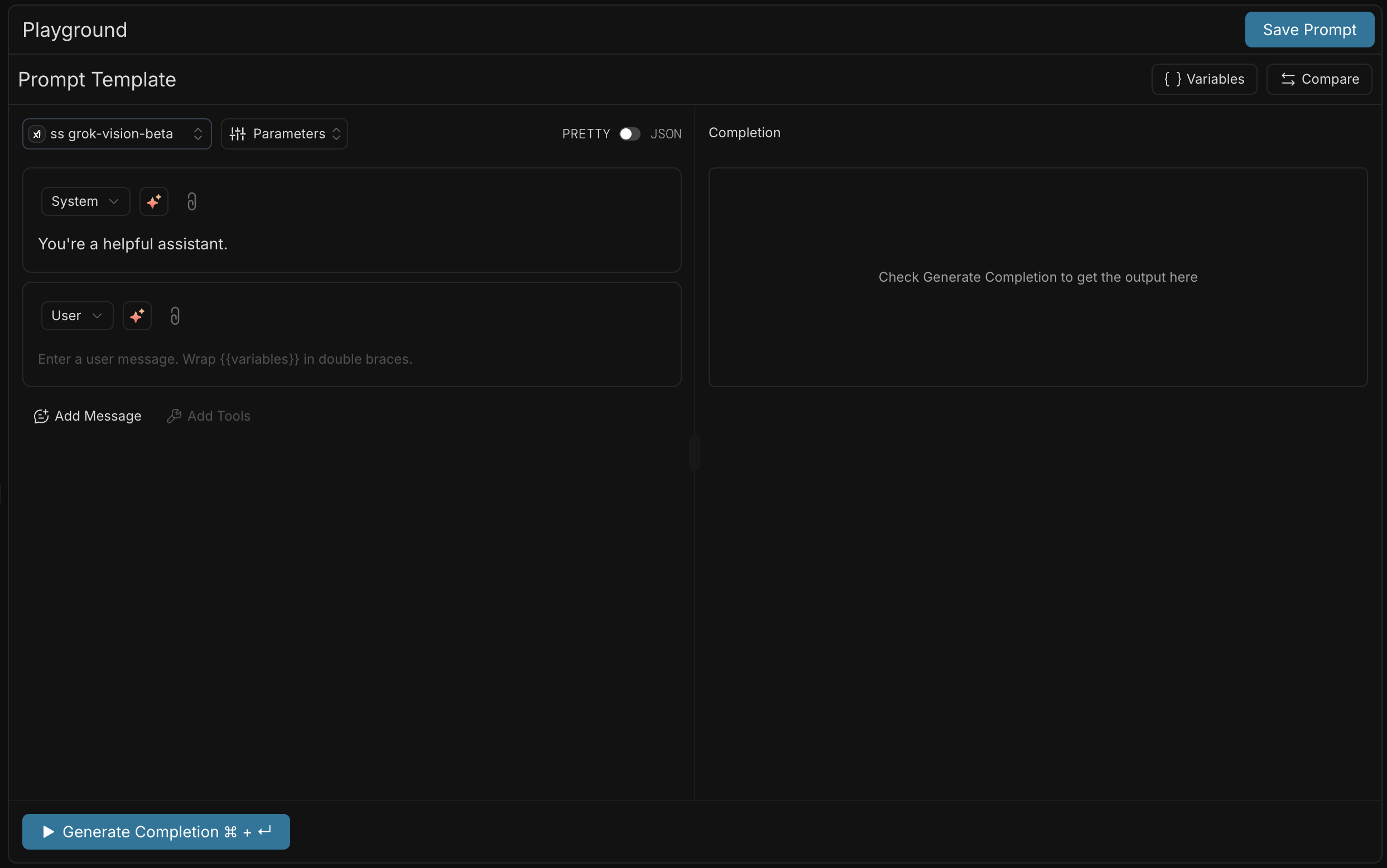
Excellent for routing, caching, and logging. The prompt passes through Portkey but lives somewhere else.
↳ Gap: the prompt has no home
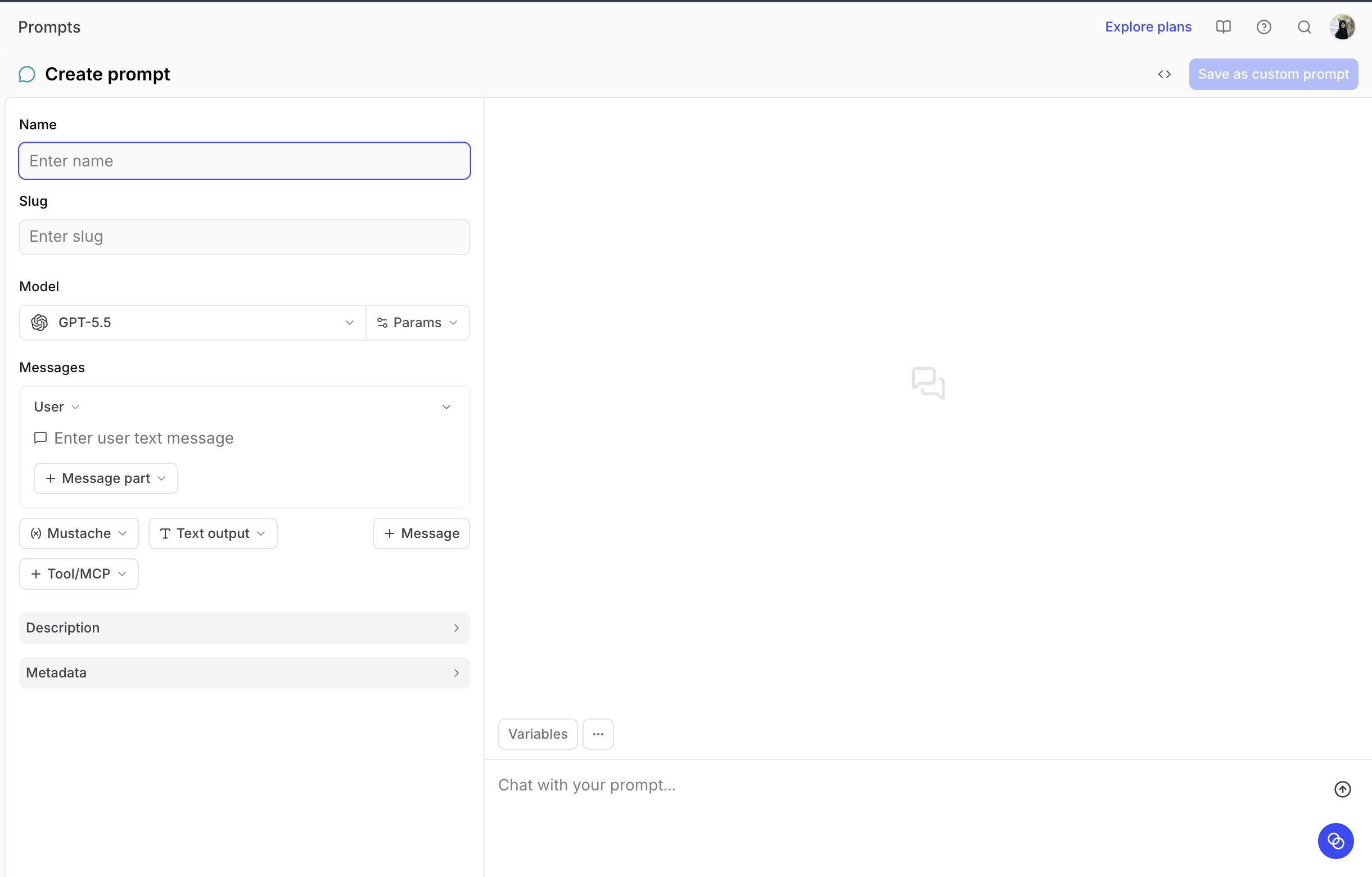
Strong eval primitives. But evaluation is the output of a well-managed prompt, not a substitute for managing one.
↳ Gap: assumes the prompt is already good
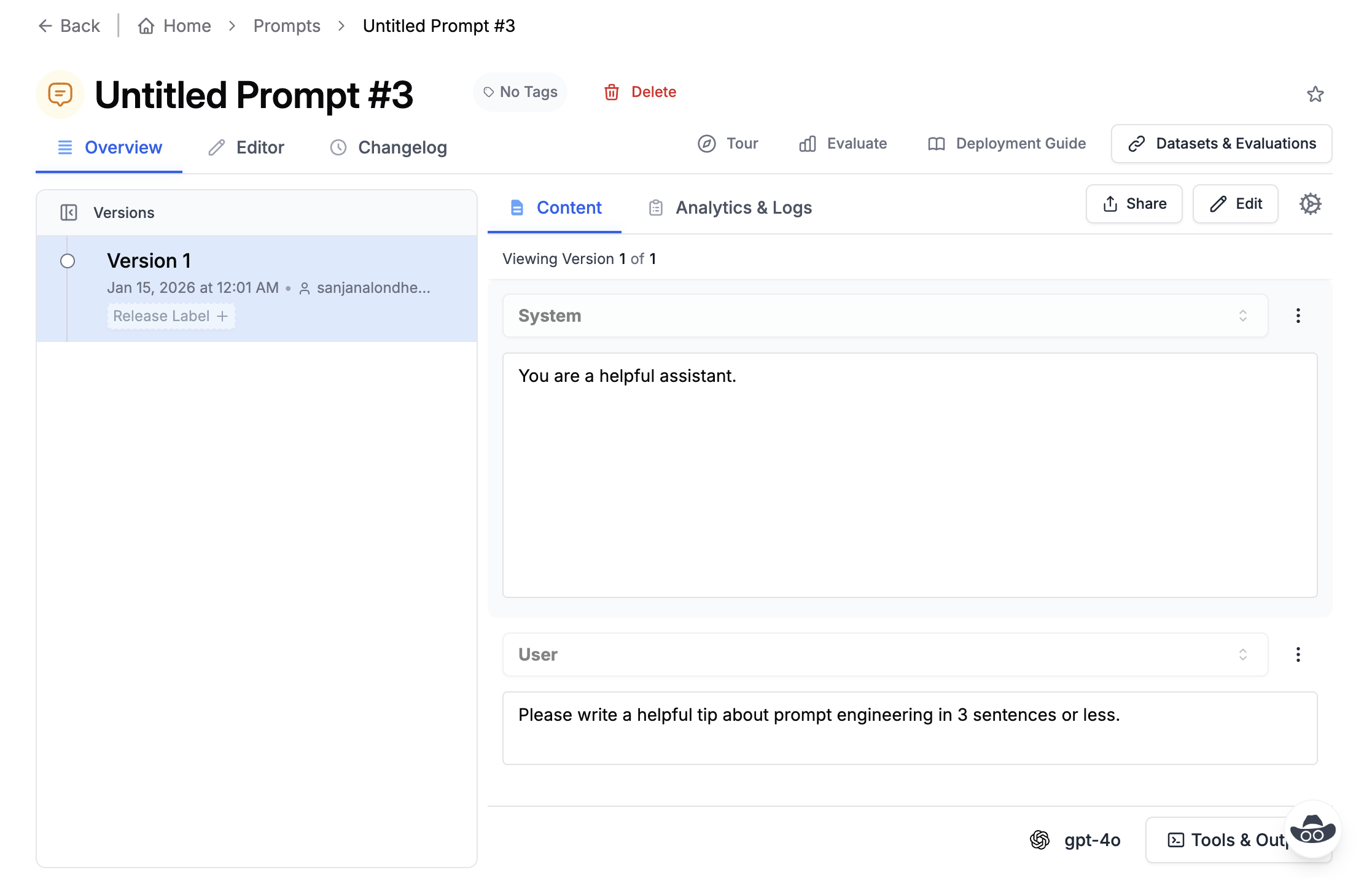
Captures what was sent, not what was intended. History without intent is an audit log, not version control.
↳ Gap: history without context
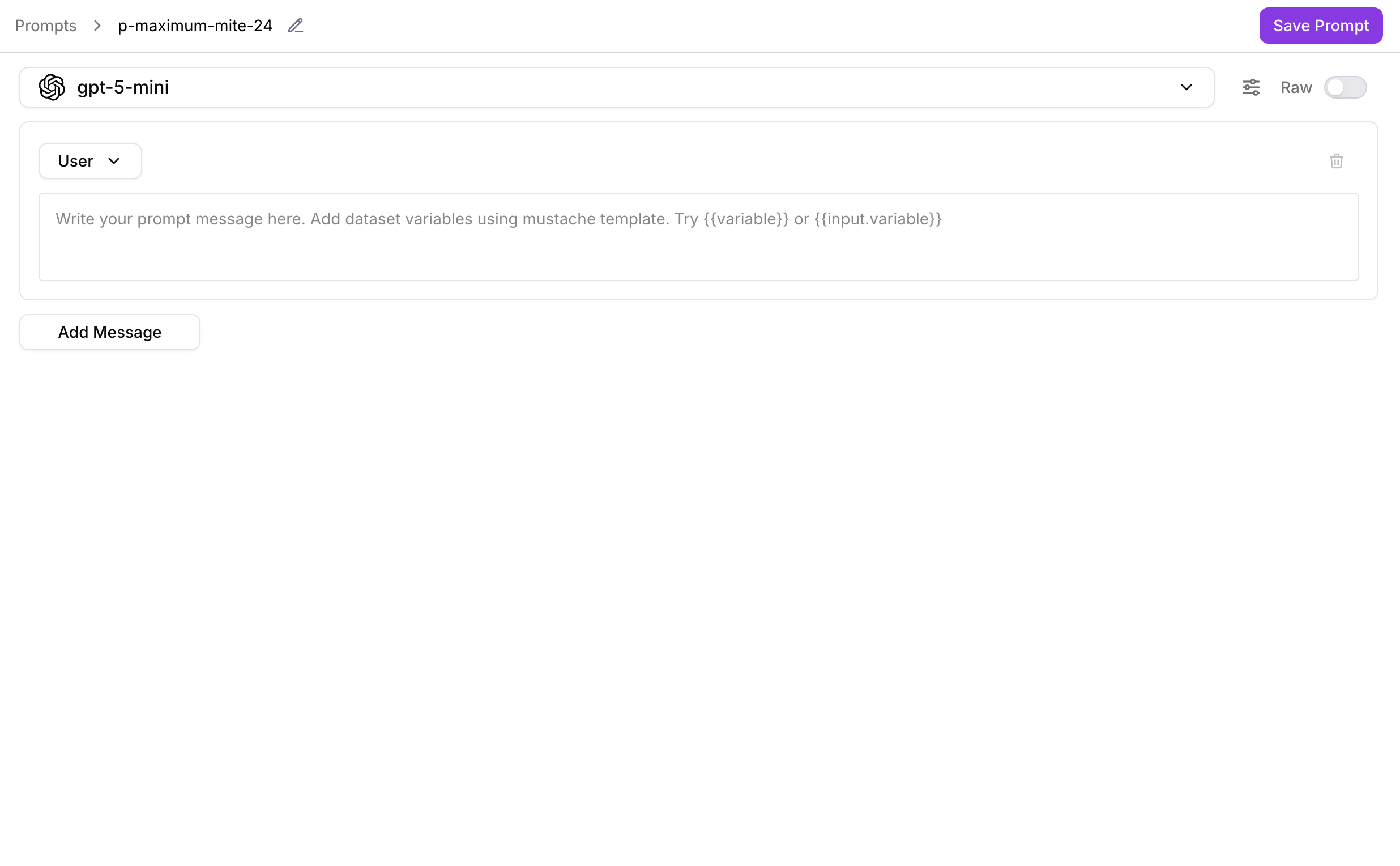
Great at surfacing quality signals in production. Assumes the prompt is already stable.
↳ Gap: monitors but doesn't help improve
architecture first. screens second.
The biggest structural question before any screen was what mental model to give the prompt. It had to be more than a text field and less than a full code editor. The answer was the role system: system context, user turn, assistant reply, each with its own panel, its own edit surface, and its own meaning. That structure became the foundation everything else was built on.
Three roles (system, user, assistant), each independently editable, each labeled persistently. The variable system ({{placeholder}} syntax) established as the bridge between the static prompt and the dynamic test input. Locked before any UI was designed.
Structured editing, scalable testing, version control, and eval connection were designed as four independent pillars, each solving one research problem, and then composed into a single left-to-right workflow.
Prototype sessions used each participant's own production prompts. Task: commit a version, run it against a dataset, compare against the previous version. Measured whether the commit message requirement felt like overhead or like documentation that paid off on the next session.
Structured role editor with persistent labels, variable syntax, real-time fill state. The foundation everything else runs on.
Single input → AI-generated variables → dataset import → bulk parallel run. Same workflow regardless of test scope.
Commit with required message, restore any version, compare two or three, one-click eval from any output. The quality loop closed.
system. user. assistant. not one textarea.
Most teams wrote prompts in a single block of text. Workbench surfaces the three-role structure that every LLM conversation actually has, making each role independently editable, labeled, and visually distinct. Variables turn static prompts into parameterized templates with real-time fill state.
- ·Separate panels make the mental model explicit. When everything is one textarea, teams lose track of what's system context and what's user input, and accidentally mix instructions into the user turn. Separate labeled panels make the architecture visible to anyone who opens the prompt, including ML engineers inheriting it six months later.
- ·Variable state is visible in real time. Every {{variable}} slot in the prompt has a real-time state: red when unfilled (run blocked), green when filled (run ready). Engineers see at a glance whether the prompt is ready to run, without scanning the text for gaps.
- ·Role labels stay pinned while scrolling. For long prompts, the System / User / Assistant labels are sticky, so orientation is never lost. An engineer reading a 400-token system prompt always knows which role they're in without scrolling back to the top.
from one input to five hundred, no custom script required.
Testing a prompt against one input is easy. Finding the edge cases requires testing against inputs that represent the full distribution of what users will actually send, and those inputs are hard to come up with manually. Workbench gives teams three paths to test data: AI-generated variables, dataset import, or typing directly. All three run the same bulk parallel execution.
- ·AI-generated variables break the same-3-examples pattern. Teams repeatedly tested against the cases they already knew worked, confirming existing behavior instead of finding new failure modes. AI generation produces diverse, realistic inputs across the full variable distribution, including edge cases the team wouldn't think to write themselves.
- ·Dataset import maps columns to variables automatically. If a dataset column is named customer_name and the prompt has a {{customer_name}} variable, they're matched automatically. The best test inputs are already in the team's production data; import connects to them directly without export/re-import.
- ·Manual inputs cover the quick one-off case. Not every test needs a dataset or AI generation. Typing values directly into the variable panel stays available for a fast, single check, the same panel and fill-state feedback as any other run, just without the setup.
- ·Every run is a complete record. The output panel shows the full response alongside token count, latency, and model used, not just the text. Any run can be committed, added to a dataset, or sent to evaluation in one click. Running is never a dead end.
commit. compare. recover. the three things teams were doing manually.
A commit in Workbench captures the full configuration at a point in time: prompt text across all roles, model, parameters, and a required commit message, the "why," not just the "what." Every version is recoverable. Compare mode puts two or three versions side by side with diff highlighting to answer "is this actually better?" with a visual, not an argument.
- ·The commit message is required, not optional. The discipline this creates, writing the "why" for every change, is worth the friction. When an ML engineer inherits a prompt six months later, they can read the full commit history and understand every decision that was made and rejected. The commit log is the long-term memory of the prompt's evolution.
- ·Compare mode answers "is this better?" with a visual. Diff highlighting shows exactly what changed between versions. The score delta shows which version won. The argument about "which is better" is replaced by a visual.
- ·Any version is one click from being current. When a prompt breaks, restoration is immediate, no hunting through Notion docs, no copying from Slack threads. The version with the last known good behavior is always in the history, always restorable in one click.
compare, side by side. prompts, models, parameters, outputs.
Users can compare prompts, change models, change parameters, and see side by side outputs.
one click from output to eval. the quality loop, closed.
The moment a prompt produces an output, the next question is always: is this good? Workbench surfaces that question as a single "Evaluate output →" button that carries the full context, prompt, variables, model, output, into the evaluation system automatically. No copy-pasting. No re-entering inputs. No context lost in the handoff. The result comes back with a score, a verdict, and a plain-language reason.
- ·One-click handoff carries full context. Every eval launched from a Workbench output arrives pre-filled: prompt text, variable values, model, parameters, and the output to evaluate. The engineer never re-enters anything. The context loss that happens in a manual copy-paste workflow is eliminated entirely.
- ·The reason is the product. A pass/fail score tells engineers what happened. The reason tells them what to change. The reason is a design brief for the next prompt iteration, not a red dot to dismiss.
- ·Eval results feed back into the commit. A Context Adherence failure points directly to a system prompt fix. An Instruction Adherence failure points to an instruction that needs strengthening or a few-shot example that needs adding. The eval result isn't a verdict on the finished prompt, it's the input to the next version.
we put Workbench in front of engineers running their own production prompts.
We made it live with all enterprise customers.
Prototype sessions gave each participant their own production prompt, the one they were actively iterating on, and asked them to complete a single task: commit a version, run it against 20 inputs, compare against the previous version. No instructions. No guidance on where to start.
"The commit message thing, I was annoyed by it at first. But then I opened v3 two days later and the message said 'switched from GPT-4-turbo, testing latency difference' and I immediately knew why the output style had changed. I would have spent 20 minutes figuring that out otherwise."
The most significant validation signal wasn't from the users we designed for. Workbench started as a tool for prompt engineers. By the time it shipped, the most enthusiastic early users were product managers and ML engineers who had never called themselves prompt engineers. The features they valued most were the basics, a place to write, a way to save, a reason to trust that what was working yesterday would still be working tomorrow. The structured editor and the commit history did more work than any other surface in the tool.
The compare mode produced a behavior we didn't anticipate: PMs started running their own version comparisons independently, without asking an engineer to run the test for them. The side-by-side with scores gave them enough context to make a deploy decision on their own. That was a capability shift, not a UX improvement.
what teams got from treating the prompt as the product.
the Notion doc got archived. the prompt finally had a home.
The informal backup system every team had improvised was replaced by a first-class commit history. Restoration went from "hunt through Notion" to one click.
500-row test runs without a line of code. Dataset import and AI-generated variables gave teams coverage over the full distribution of inputs, not just the familiar 3.
Technical PMs ran version comparisons independently, without asking an engineer, and made deploy/hold decisions based on scores and diff, not intuition.
ML engineers inheriting prompts could read the commit history and understand every decision and rejection. Intent survived the handoff for the first time.
Workbench was designed for prompt engineers. PMs and ML engineers became the most enthusiastic users, the structured editor and commit history did more work than any advanced feature.
One-click eval from output, carrying full context, closed the loop between "I made a change" and "here's whether it's better, and specifically why." Quality became a first-class output of the iteration process.
three things I'd do differently. one I felt within the first week of beta.
Workbench shipped without eval baselines, with round-one research limited to technical users, and with the commit message requirement added late. All three were visible in early usage patterns before the beta ended.
Instrument eval baselines before the beta, not during. Teams started using Workbench without a baseline score for their existing prompt. When they ran evals on v2 and got 0.71, they had nothing to compare it to, was that good? Worse than before? The baseline measurement needed to be the first action the tool prompted, not something we added as a best-practice recommendation in the docs. Without it, the eval results had no anchor.
Pull non-technical users into round-one research. Discovery was scoped to engineers and prompt engineers, the obvious users. PMs and ML engineers were brought in later as secondary validation. That was backwards. Their vocabulary for what was broken was more honest than the engineer's phrasing, and would have sharpened the problem framing before design started rather than after it shipped.
Build the commit message requirement in from day one. It was added mid-design as an afterthought, and almost cut before shipping because it felt like friction. It was the single feature that most users called out positively in post-launch feedback. The discipline it creates, writing the "why" before moving on, is worth the three extra seconds. Features that feel optional at the start almost always turn out to be table stakes for the audience you're building for.